

George Innes is a long established building construction company, based in Moray, Scotland.
They wanted an updated logo design that reflected their high quality workmanship, and excellent customer service.
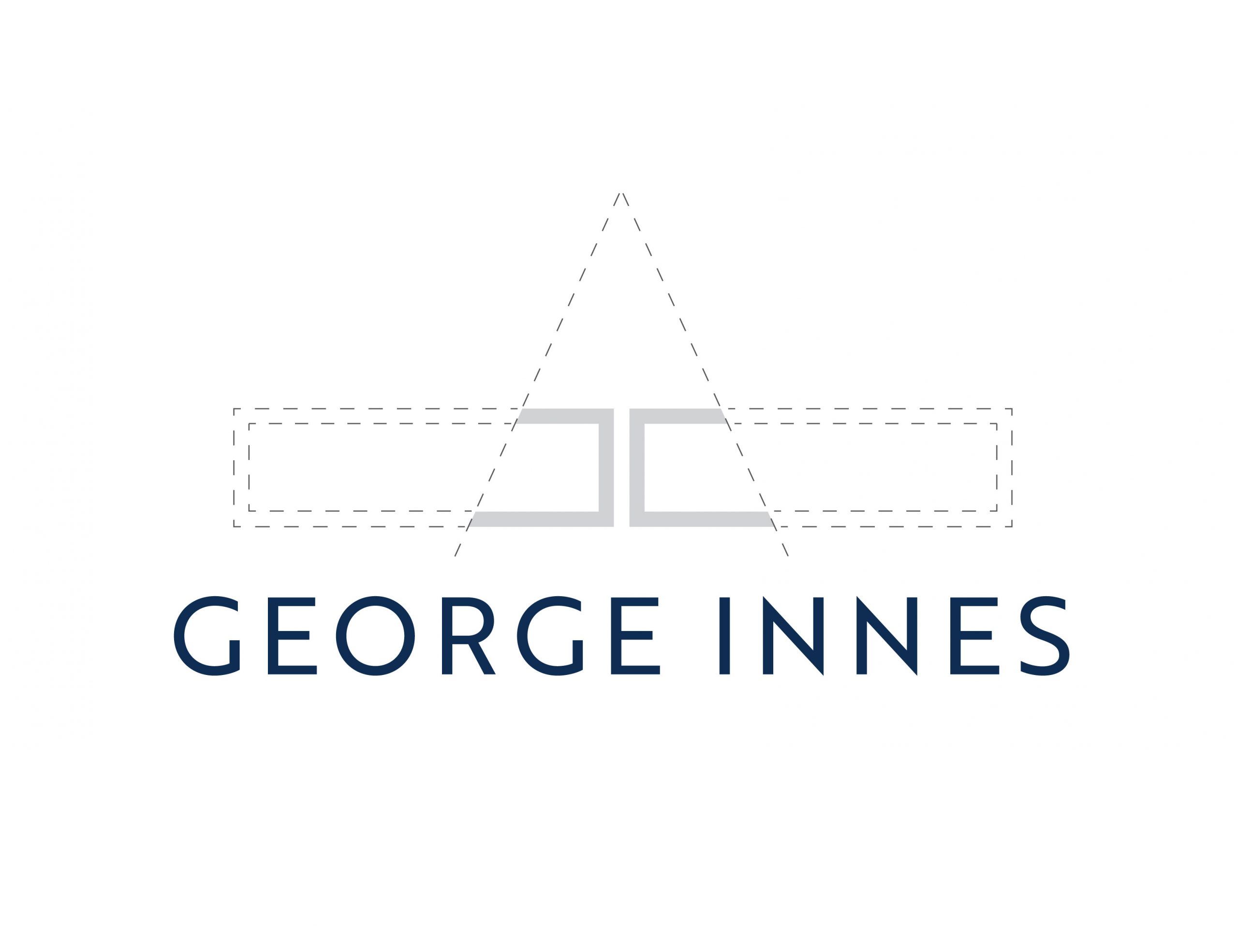
The design is simple and clean, giving the impression of a quality, high-end, luxury product and professionalism. I selected this particular typeface as I fell in love with its clean lines and precise letter.
Where possible I like my designs to tell a story – the inspiration for the icon comes from a house brick, and the angles of the bricks create a pitch of a roof. It creates a striking icon – whether or not you know the story!
logos | stationery | leaflets | brochures | newsletters | pull-up banners