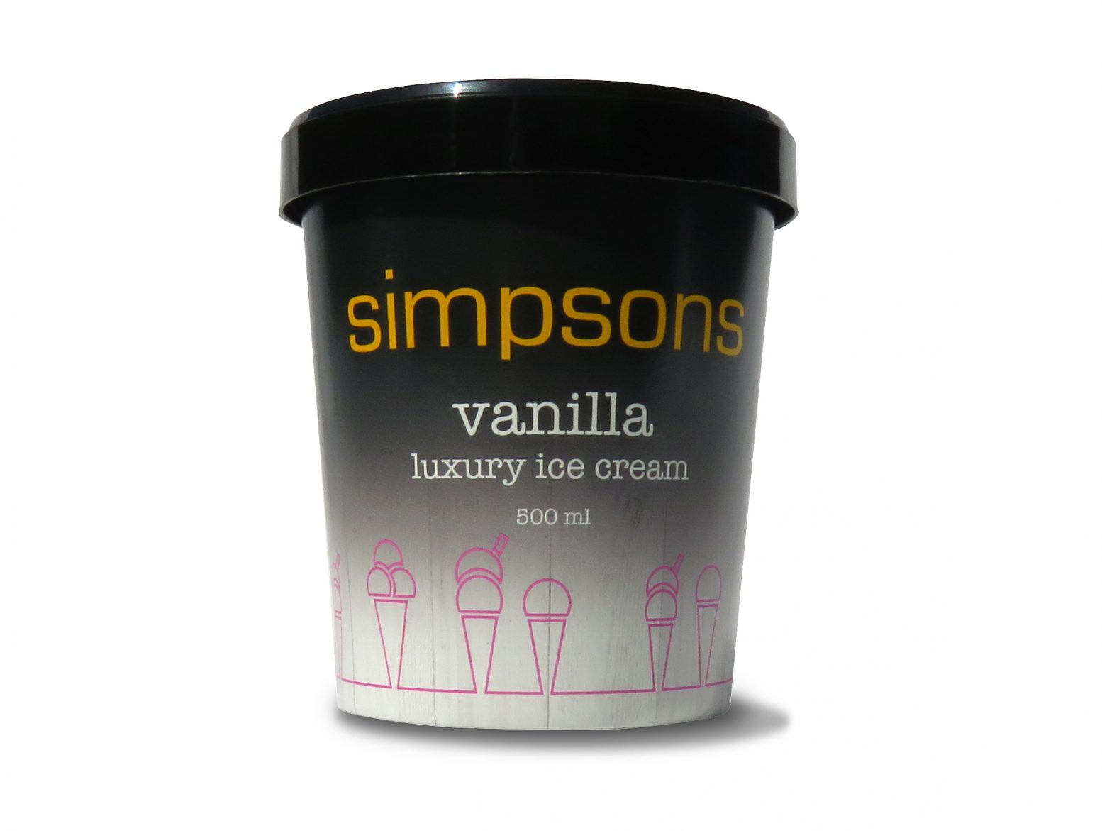

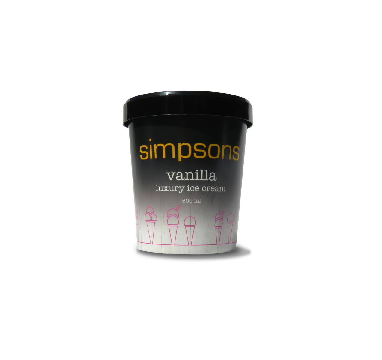
Simpsons have been established as a luxury ice cream manufacturer since 1989.
They were producing their own product labels in house on standard white ice cream tubs, with no promotional literature. Because of this, some of their luxury stockists would repackage the ice cream into their own, more luxury looking packaging.
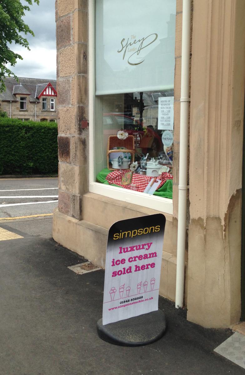
I initially came up with a new logo design, using a simple clean font in the yellow that they had been using previously. The cones graphic followed – this needed to be very flexible and user friendly.
It can be used on a black or white background and printed on anything from promotional merchandise, to packaging and vehicle graphics. Finally, by switching to black tubs their amazing ice cream has a luxury feel to it, as well as a luxury taste!
Clare is so good to work with and has great ideas. I was looking to refresh my packaging and branding, Clare did a fantastic job. We receive so much compliments on our packaging and are currently working closely with a multiple who are keen to stock us as they feel that as well as having a great product our packaging would look great on their shelves. The work that Clare did on our branding and packaging allows us to be able to compete quite comfortably with any major ice cream brand.
Claire Stewart,
Simpsons Luxury Ice Cream
logos | stationery | leaflets | brochures | newsletters | pull-up banners