

I’d worked with Stuart Nickerson whilst he was the distillery manager at Glenglassaugh Distillery, so when he got in touch to see if I’d be interested in designing for a brand new company he was a director of, I jumped at the chance.
The new company was Shetland Distillery Co. and their first product was going to be a gin. My brief was to come up with a logo design for ‘Shetland Reel’ – it needed to encompass Shetland. It’s location, music, people and ruggedness.
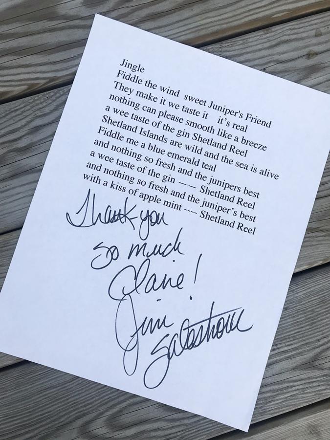
I’ve been to Shetland many times which was a great help in understanding the uniqueness of the islands. Along with doing my own research, a jingle had been written for the gin, in preparation for the launch party. Jim Salestrom, Dolly Parton’s guitarist and good friend of Frank Strang, one of the other directors of Shetland Distillery Co. had written a short piece of music to celebrate the launch of the new gin. I got to see the lyrics which helped cement the design ideas I’d already had. It was this verse that really resonated with me;
“Shetland Islands are wild and the sea is alive
Fiddle me a blue emerald teal”
At the launch party on Unst in Shetland, I was fortunate enough to meet Jim, and tell him how his lyrics had helped with the design.
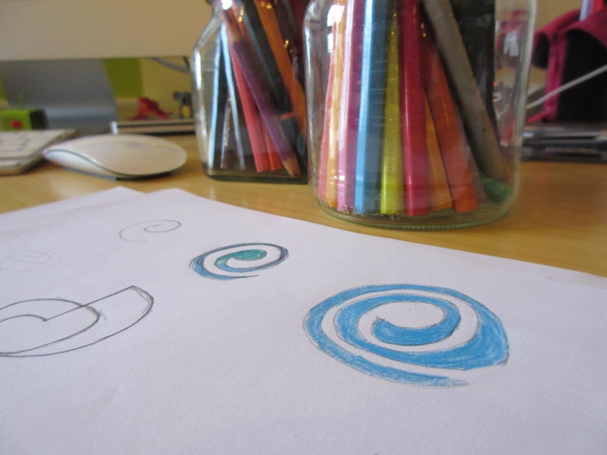
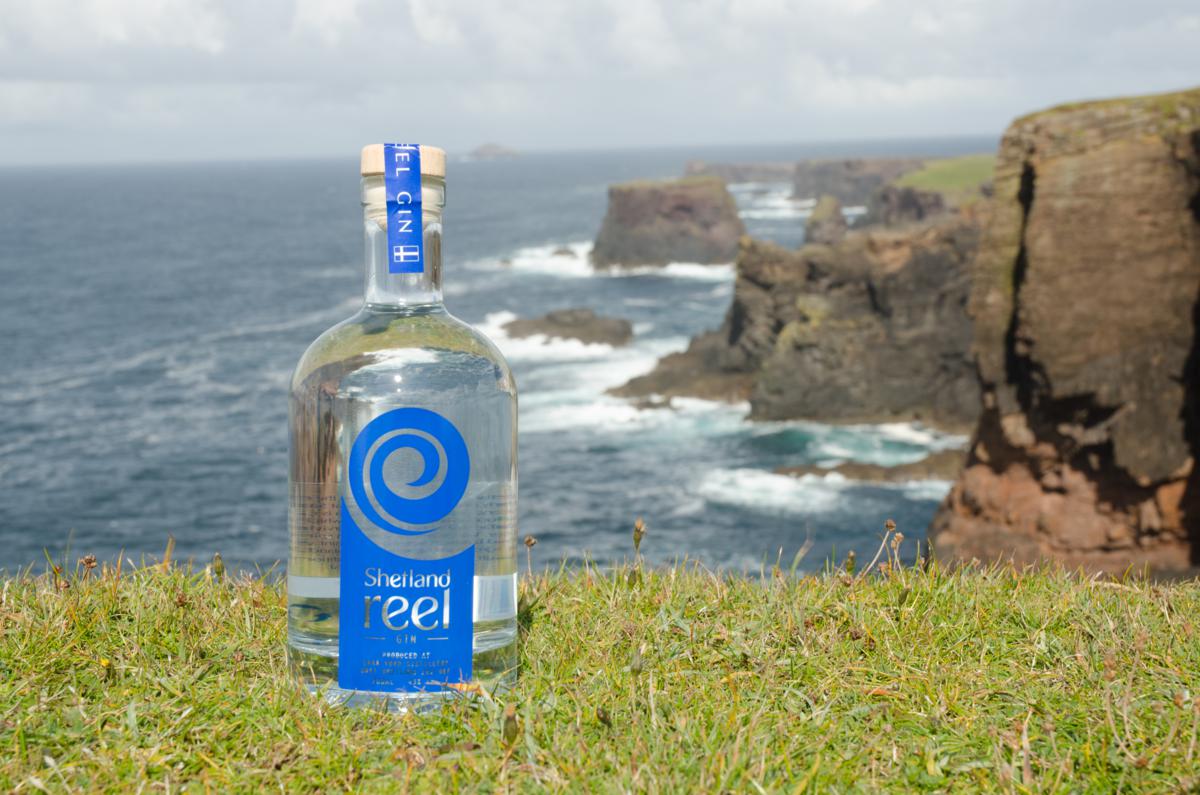
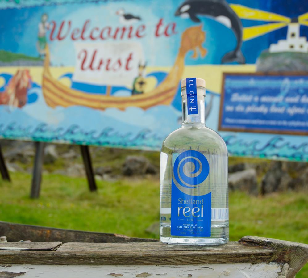
The design that was chosen to launch Shetland Reel Gin was a swirl – based on a violin head and the curl of an ocean wave, this design symbolised two key parts of Shetland life. It also gave the brand a story that could be told and used in marketing the new product.
The swirl has now become synonymous with Shetland Distillery and although the bottle design has gone on to be updated, the swirl has been retained and is helping it to become a recognisable, award winning brand around the world.
logos | stationery | leaflets | brochures | newsletters | pull-up banners