
Simpsons is a family run business and were established in 1995.
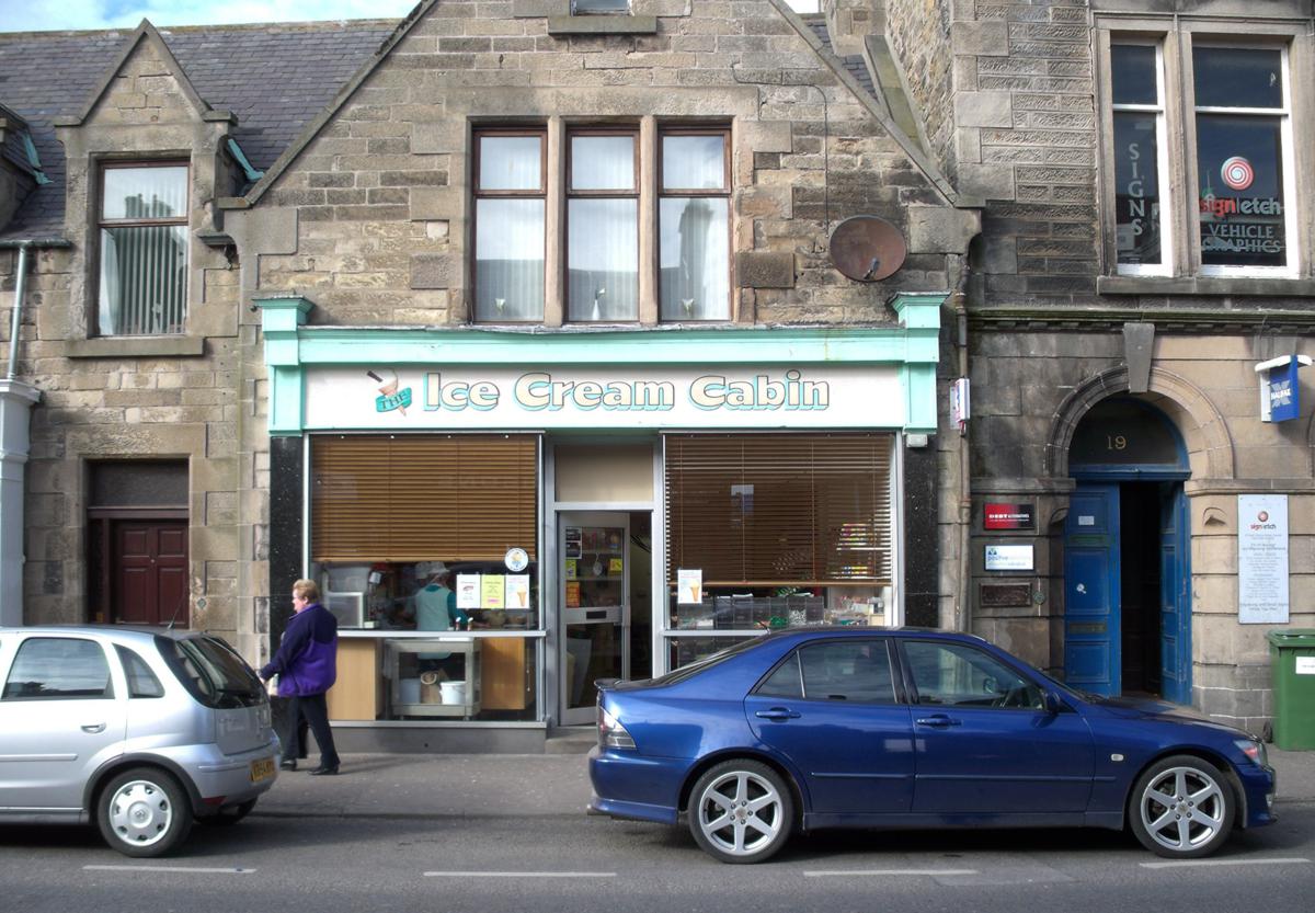
When they first came to me they had a retail shop in Buckie town centre with a small processing area in the back room to make their luxury ice cream and were called Ice Cream Cabin. They were selling their luxury ice cream to the public as well as local ice cream parlours, hotels, cafes and restaurants.
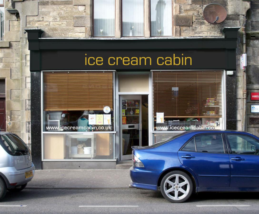
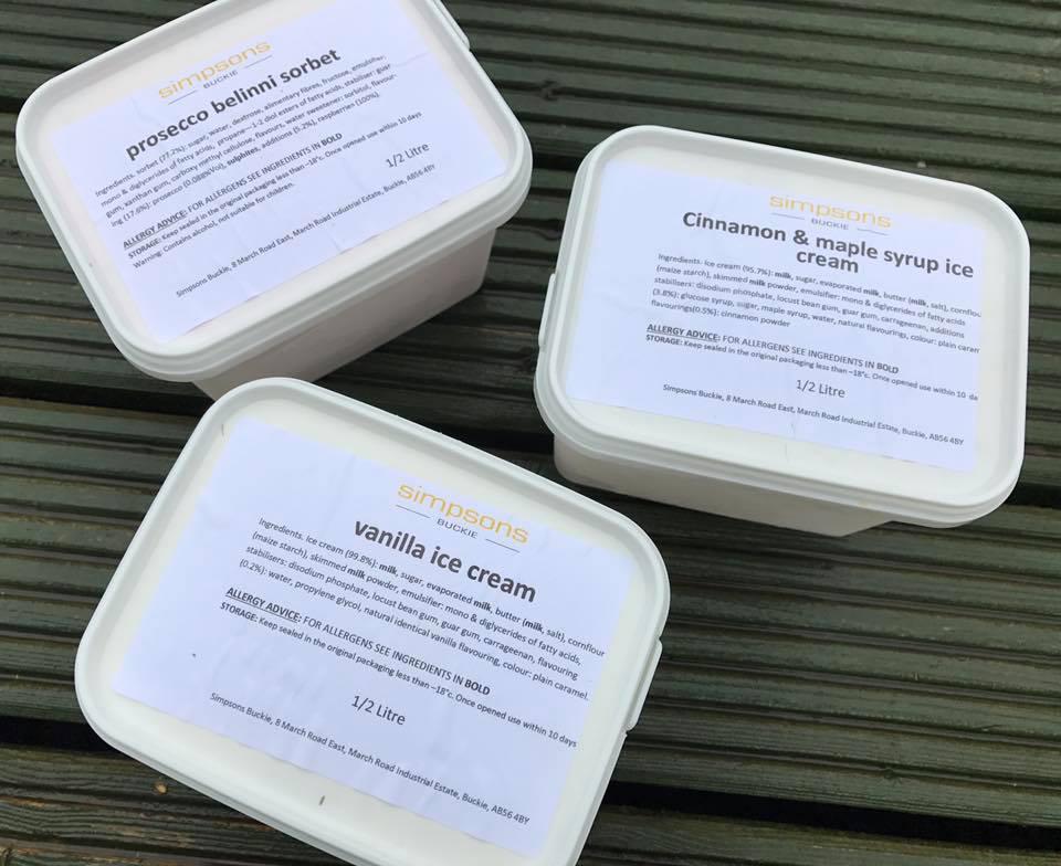
At this time they were printing their own labels and using off the shelf white ice cream containers. We started by updating thier logo and introducing a new colour palette of black and yellow. This was applied to the shop frontage, new stationery and used on the labels for the ice cream. They started to use this new look, then decided to rename the business Simpsons. The design was updated to the new name and was used for a number of years, and by this time they had sold the retail arm of the business and moved into a small factory to concentrate on commercial sales.
![]()
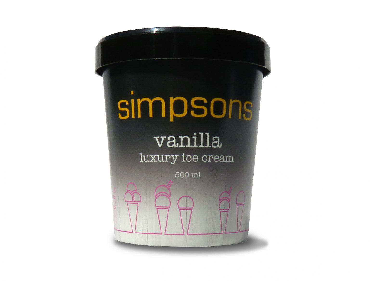
It was then that they came to me to look at updating their whole brand image, including their packaging and van livery. I presented several design options for them to choose from. They settled on the cones design as this design could be very flexible in how it was used and applied, from ice cream cabinets, containers and signage.
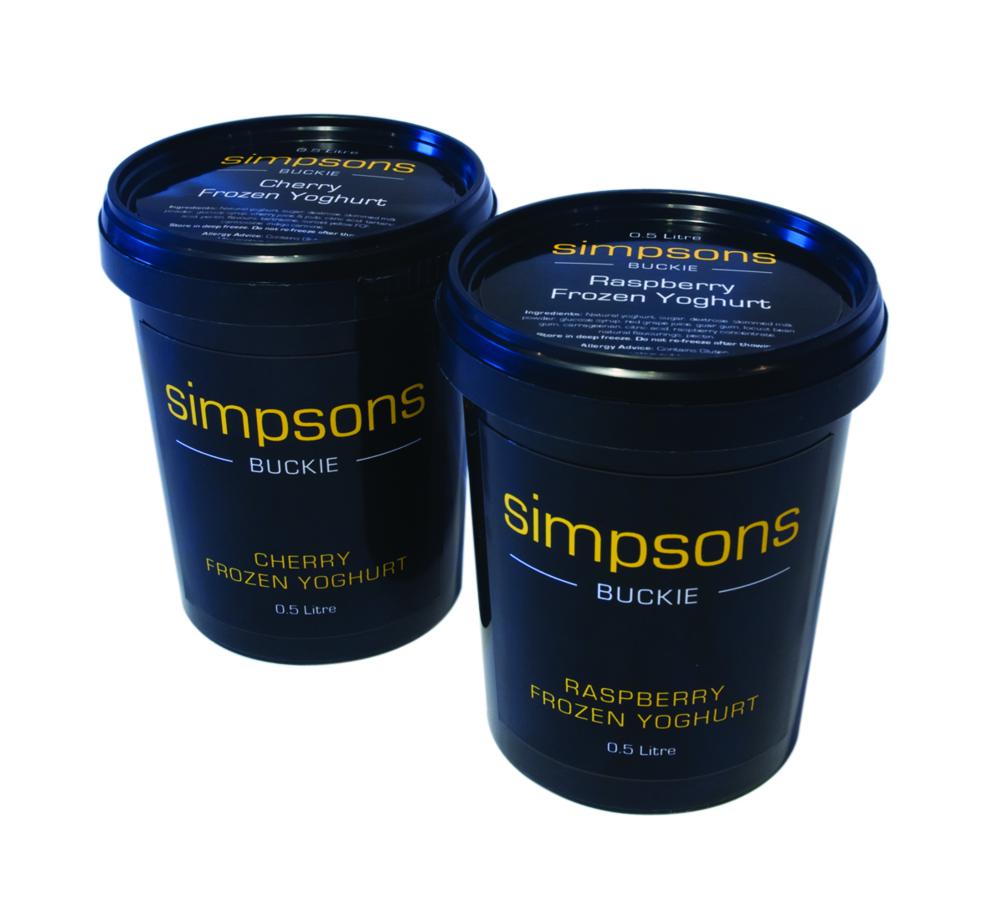
Claire the managing director sourced an ice cream tub supplier in Italy, moving away from the traditional white rectangle tub, to a more modern black round tub. We started to work on the design for their core flavours using two sizes of tub.
The rebrand has been a total success it now has a far more cohesive lookand is far more appropriate for the luxury market it occupies, sitting well against its direct competitors.
logos | stationery | leaflets | brochures | newsletters | pull-up banners